
Main Menu | Archive | Links | About Aktivität

The Artwerk of Kraftwerk
'The Artwerk of Kraftwerk' takes
a look at the influences on Kraftwerk record cover designs, by IC
From Aktivität 7- September 1995.
Revised and updated June 1999 and July 2000
Music is only part of the message of Kraftwerk. It is obvious that the band are as much concerned with the concept of 'ganzheit' (wholeness) or 'gesamtkunstwerk' so it is no surprise to learn that the bands choice of graphics also plays as important a role as the music and text.
The most interesting period for Kraftwerk's cover art was in the 1970s, when the sleeve designs mixed images/concepts from various original sources. Throughout the '80s and '90s, the bands record cover designs have become more simplistic and less influenced by non-Kraftwerk sources. The artwork for the 'Radio-Activity' album for instance contains a multitude of images; the use of an antiquated radio set, the 'Volksempfänger' radio set from 1930s Germany; the 'radio mast' painting, redolent of the famous 'RKO' film studios image that would open many a classic black and white movie, again from the '30s, visually depicting the invisible waves pulsing into the ether. Even the photo of Kraftwerk themselves; Ralf's choice of microphone again harks back to an earlier era. Such a microphone conjures up images of the golden age of radio, before television arrived, when it occupied prime position in the home-entertainment stakes. These images contain overtones of an earlier time and frame of mind, adding further layers of meaning that the music of 'Radio-Activity' itself can't add.
The stylish sleeve design for 'Trans-Europe Express' continues with this idea of recreating an image of the past, an earlier, stylish and even romantic era of travel. The photos of Kraftwerk used on the cover actually date from a couple of years before the LP's release, before 'Radio-Activity' even. These are photos but with additional airbrush artwork, this treatment reminiscent of glamorous film star and big band portraits of an earlier age. The choice of typography (font: Futura, from the late '20s) used in the sleeve is again redolent of a '30s/'40s era design, stylish sans serif type, identifiable with poster designs of such an era.
In an interview published in Aktivität issue 7, Kraftwerk's artist in residence Emil Schult explained that the painting on the inner sleeve (which pictures the members of Kraftwerk sat around a neatly covered café table with a lush backdrop of foliage and rolling hills off in the distance) as "a collage of a Maxfield Parrish painting, a photo and my artwork". The photo in question is an earlier portrait of Kraftwerk, first published as a promotional photo for the 'Radio-Activity' album and on the German 7" single cover for 'Radio-Aktivität' in 1976. Maxfield Parrish came to prominence primarily through his painting, 'Daybreak', described as being a kitsch example of stylish art. It is unclear whether it is this precise painting that is the one referred to by Emil Schult; a number of Parrish's works are in a similar stylistic theme. If we assume that it may be, the sun-dappled leaves and mountainous background are the elements of the painting incorporated into the Kraftwerk picture. The painting has itself featured on at least two other record sleeves; the most recent back in 1984, was 'The Waking Hour', the first, and only, LP by Dali's Car, the band formed by Mick Karn (ex-Japan) and Peter Murphy (ex-Bauhaus). It has also been used, in a re-designed pastiche form, on a Moody Blues LP sleeve.
A more detailed look at the techniques at play in the 'Trans-Europe Express' sleeve can be read in the 'Spot the difference' article from Aktivität 10.
The most striking example of this synthesis of historically inspired images is the 'Man Machine' album. Often misinterpreted as a fascistic design, it mixes the ideas of the 'man-machine' concept that Kraftwerk had talked openly of for a number of years beforehand, with the post-revolution Russian Constructivist art and its idea of a 'mass man', a cog in the machinery, and similar 'rabotnik' (worker) concept too.
The front cover of 'The Man Machine' is very much a take on Russian poster art, used to communicate ideals via the strong, angular graphics and heroic poses of the workers portrayed, gazing aside into the distance. The angular graphics first came to light with the art movement of constructivism, a group with influences from both cubism and futurism; all of these particular movements have, to varying degrees, a common theme of the machine age running throughout. Hence the ambiguity with fascism; the futurist art movement employed similar stylistic means to communicate their vision of modernity. New Order, a band who have openly acknowledged their influence by Kraftwerk amongst others, have in the past used almost direct copies of Italian futurist art manifesto covers on their record sleeves ('Movement', 'Procession'/'Everything's Gone Green').
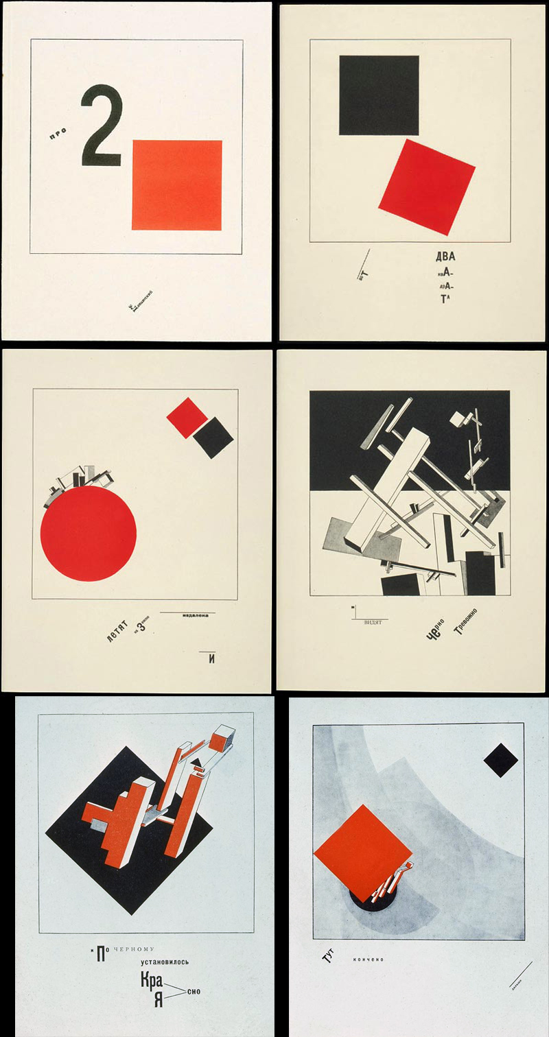
A leading figure in constructivism was an artist by the name of El (Lazar) Lissitzky. The design of the back cover of 'The Man Machine' is a straight copy on one of El Lissitzky's works. The original appeared in a book, 'Of 2 Squares', first conceived in 1920, published in both German and Dutch editions later. This little book was intended, as El Lissitzky explained, as a playbook for children which might also amuse grown-ups. The design of the book is, as was El Lissitzky's aim, made from simple, geometric shapes, minimalist in style, free from the influences of the past to represent the present and future. The only colours employed being red, black and white, a dynamic arrangement of type to add to the effect. The parallels with Kraftwerk's own musical patterns of the time are obvious; linear, minimalistic - and with an economy of effort.
A sequence of events, the story of two squares and their subsequent effects, the titles of the images convey the sequence of events., 'Here are the two squares' - 'They fly on to the Earth from far away and' - 'And see a black storm' - 'Crash - and everything flies apart' - 'And on the black was established Red Clearly' - 'This is the end - let's go on'. Similar in style to one of El Lissitzky's most recognised poster designs, 'Beat The Whites With The Red Wedge', the ideological overtones are at work in the subject. None more obvious than the work that is reproduced on the rear cover of 'The Man Machine'; a detail from the image titled 'And on the black was established Red Clearly' (a detail from the image is reproduced above - click on the image to view the full size original). The Communist overtones unavoidable.
'The Man Machine, for what little it employs in lyrics, has a lot of undercurrents running through its form. The first track, 'The Robots' is a good example of how all the elements merge together; 'robot' is derived from the word 'Rabotnik', meaning worker. This could be linked into the idea of 'musikarbeiter' (musical workers) that Kraftwerk have, along with the 'man machine' idea, practised and discussed in interviews for decades now. The title of the album, in English, is accurate but also applicable and conjured more from Die Mensch Maschine is the idea of 'the human machine' as well, perhaps.
Kraftwerk's artwork throughout the '80s and '90s has become less obvious in its outside influences, more generated from within. The 'Computer World', 'Electric Cafe' and 'The Mix' are all pretty much cast from the same die; the graphics have been reduced to computerised type, either dot-matrix style, LED style or OCR (optical character recognition) type, the images of the band themselves always synthetic; either computer-generated representations or plastic mannequins. The choice of computer used on the front of 'Computer World' is perhaps the only linkage with the past, it being a rather bulky and outdated model, even in 1981.
The exception to this rule is with the 'Tour De France' single, something
of an oddity; purportedly based on the design used for a stamp from
Czechoslovakia, again hailing from the 1930s. (Update: In fact, a Hungarian stamp design from 1953)
As much a part of everything discussed here is Kraftwerk's use of visuals for their promo videos and those projected onto the screens when the band perform live. But that's another story...
Updated: 16 : 5 : 2010